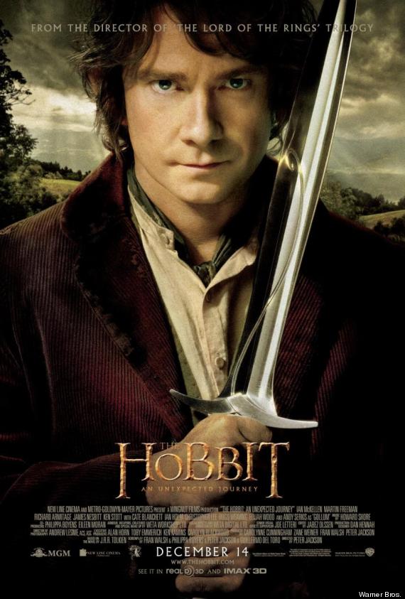
In
Contrast to the Empire magazine cover, The poster for 'The Hobbit' features the
main character of the film, Bilbo Baggins played by the famous
actor Martin Freeman. This is a different advertising approach to the
Empire magazine cover as the poster features an actor that was not in the Lord
of the Rings trilogy of film, this might mean that one whom has Watched Lord of
the rings may not know who he is. However the actor Martin Freeman himself is
quite a well know actor, However not in a hollywood blockbuster approach but is
quite a big actor in British Televison starring in things such as Sherlock and
the Highly popular series called 'The Office'. This may draw people to the film
seeing that this actor plays the main character. As well as this the art style
and the colours in the featured image are highly similar to the art style used
in the Lord of the Rings Trilogy, with the colours on the character in the
foreground being very bold and the overall contrast of the image being very
high, and the background colours being very washed out and aged looking, this
makes the character in the foreground stand out and making it the first thing
the viewer looks at and the thing in which they focus on. The character 'Bilbo'
is holding a sword and together with his clothes would indicate to the viewer
of the poster that the film is set in a time before technology, or a fantasy
land, being Tolkein's Land AKA Middle Earth, where the film is set.
The
next thing that the audiences eye is drawn to is the "The Hobbit"
title placed in the middle of the page close to the bottom of the poster. The
title is in the same colour and font as the original three films, which shows
an almost ancient stone like font, which means that people that have seen the
other three films will know that the film is part of the series, or a prequel
to the series (which it is) The other reason why the title is effective is
because it is eye catching, it is the second thing the audiences attention is
drawn to after the main image, which is obviously intentionally done by the
studio.
At the top of the poster
our eyes our drawn to the words at the top that read 'From the director of the Lord
of the Rings Trilogy', and although the font is slightly faded its
still clear and obvious as its right at the top of the poster. This would
draw attention to the film as the directing by Peter Jackson was met with great
response and the films won Multiple Oscars due to it. This means people
would go and see the film.
No comments:
Post a Comment