Tuesday, 17 September 2013

R&P Audience Profile 1 - 28 Days Later.

This film is essentially a Zombie Film. This would most likely attract young people (as old as 15-30) this is because younger people might be more into horrors/films of post apocalyptia. Both the setting and the zombies create a large deal of tension and suspense throughout the film, making it more appealing to those who like horror films, The dominant gender that are likely to go and see the film would be male, however that does not totally rule out women going to see this film, however its expected that the majority of the audience will be male, due to large amounts of gore, violence and an overall bleak feeling that would entail a zombie film. The film would not appeal to a certain ethnicity as much as another, as it does not portray a certain ethnicity in any way, either good or bad. This helps the film top appeal to a wider audience as it is not specifically aimed at any ethnicity. The class of the people that would be likely to go and see the film is aimed at working/middle class people. This film would possibly attract more working class people however due to most of the characters being working class and shows it from a working equal in a sense that everyone should have the same chance in the zombie apocalypse. I also think that the film will appeal the most to middle class/ working class students in collage or university. The film is filled with tension and suspense, the kind of thing a student would want to see in a film. Its also one of the more artier zombie films to come out, due to camera


Monday, 16 September 2013

R&P: The Dark Knight Rises - Empire Magazine poster.

Empire Magazine: #271 (January 2012)


The main character featured in the "Dark Knight Rises" cover of this edition of Empire Magazine is of course, Batman, the main hero in the film and a icon of characters in the media. This helps the audience to immediately identify the film, even without looking at the title of the film.


The main character can be seen in the image wearing the icon Batman outfit and is holding some sort of technologically advanced weapon, and for those who have seen any films of the trilogy would know it would be some sort of awesome gadget to look forward to. Weapons and furturisit gadget have become an icon of Batman, as he doesnt have any powers like almost all of the other super hero's, but needless to say, he popularity in the world of super hero's is undeniable. Batman has a huge fan base and anyone that did not know the genre of the film, or what the film is about are few and far between, even those that are not huge fans of the franchise still know who Batman is and what he does. If for some reason a member of the audience did not know what batman is or what genre the film is, the fact Batman is in a costume and is aiming some sort of weapon/gadget at something very much infers an action film.
The main character in the image, Batman, is wearing the standard batman outfit and mask, this is not surprise as its the most iconic thing about batman. The background of the image however is different than most of the other Empire cover images. The background image is just plain black image with some kind of lense flair radiating around Batman. The lense flair illuminates Batman so that the audicne can see the character clearly, as the background is the same colour as the character. This also suggests the dark feeling to the film, that it is by no means a happy film.

The title of the film is in white, which makes it very visible to the audience and makes it stand out from the rest of the image. The positioning of the name of the film however is alot different that that from alot of other Empire covers. This one is located in the bottom left of the cover, but most of the titles on the empire covers are located close to the middle on the vertical center line. This does have an impact on the cover as the title is not as in-your-face as the other where it is located in the middle of the page, but that does not mean that the title is not visible to the audience, because it is. The font used is the same as that used for most of the Empire covers and is similar to the font used in the Empire title at the top of the page. This helps to keep the page looking clean and appealing.

Other than the main image and title, there is not really much else in on the cover of the magazine, this helps to attract the audiences attention to the main image and the main name of the film, which is what you want if you are advertising a film.


R&P: Django Unchained Trailer Analyisis


One of the main selling points of the film is the director, Quentin Tarantino, who has directed other films such as Pulp fiction and Reservoir Dogs.Tarantino has a very specific style that carries over thoughout all of his films. This style of his appeals to many audiences, which means that fans of his other films, will want to go and see Django. Tarantino's style glorifies violence with much blood suspense and obscure tense situations which the characters find them selves in which put the audience at the very edge of their seat. Some of this makes many of his films controversial but they still appeal to a large audience as they all swarm in to see the emotional roller coaster which is a Quentin Tarintino film much displayed by the trailer. Audiences are also attracted to Tarintino films, because of the familiar actors he uses in his films such as Samuel L. Jackson and Christopher Waltz.


The film is not a conventional western film, there is no dedicated hero and the hero's "sidekick" is not conventional at all and has a huge role to play in the film. The sidekick in the film is actually a bounty hunter (played  and saves the hero at the beggining of the film, and plays a major role in the rest of the film. Django is not a conventional hero, yes his role in the film is saving a 'damsel in destress' being his wife. However he spends most of the trailer not saying alot and due to the setting and his race it means that the 'side

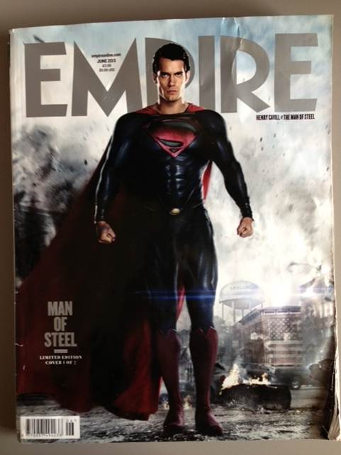
R&P - Magazine Covers - Empire: Man of Steel


The Layout is very much concentrated on superman with him being the centre of attention, usually on magazines we see the puffs or anchorage text surrounding the front page, however for this issue it seems to only concentrate on man of steel. Which will show man of steel in a very good light as the 'all important movie of the month'


The largest font is the title of the magazine to obviously show the product so people know what they are buying, The text of 'MAN OF STEEL' is the only other prominant text which adertises the film and confirms that the magazine will have information on the film.


R&P Django Unchained Film Poster


This poster has an interesting design, with the characters being in black and white, and the rest of the poster in colour, mostly red however. This has the effect of making the titles stand out, rather than the character in the poster, however the characters in the middle of the poster are still the center of attention. The character being in black and white may also give the audience an idea of the time era the film is set in. The blood that is splattered behind the main character but in front of the other characters is in colour unlike the actual characters. This helps to attract the audiences attention as well as give an indication of the genre of the film and what the film will include, but after seeing that it is directed by Tarantino, this is a clear indication that the film with contain a lot of blood and violence

The poster features the main character of the film, "Django" in the middle of the poster, with the other main character to the left and right of him.
The characters are wearing really stereotypical western/cowboy costumes and are holding a revolver, as well as cowboy hats. This helps to identify the genre of the film.

The title of the film is located just down from the center of the page and is in a western style font and is in a bright red colour. The title is very eye catching, especially up against the black and white image of the characters, it could be said that is more eye catching than the image of the characters themselves, which is strange for a film poster. The main title of the film is not the only text that is visible on the page, there is also the credits for the actors that are located above the main film title almost in the middle of the page; which are writen in the same style as the main title text but in a white colour, as well as the credit for the director, Tarantino. There is also some text under the main film title with is mostly comprised of the institutional information. The information, other that a few other actor credits, which are white, just like the other actor credits, are in a grey colour. This enables the designers of the poster to make that information blend into the page, the same thing that is done in most other film posters. The audience does not want to see the institutional information, so why should they, so that information is hidden at the bottom of the page in a font and colour that is not bold or eye catching. Lastly, at the bottom of the page we can see the release date information, which is in the same colour and font as the title of the film only smaller. This helps to make it stand out and give the audience the information that they want.
The film poster gives the persona of a spaghetti western, everything from the characters and what they are wearing, to the art style and the blood all over the place is a clear indication of the genre.

Tuesday, 20 August 2013

R&P - The Hobbit - Poster Analysis.


In Contrast to the Empire magazine cover, The poster for 'The Hobbit' features the main character of the film, Bilbo Baggins played by the famous actor Martin Freeman. This is a different advertising approach to the Empire magazine cover as the poster features an actor that was not in the Lord of the Rings trilogy of film, this might mean that one whom has Watched Lord of the rings may not know who he is. However the actor Martin Freeman himself is quite a well know actor, However not in a hollywood blockbuster approach but is quite a big actor in British Televison starring in things such as Sherlock and the Highly popular series called 'The Office'. This may draw people to the film seeing that this actor plays the main character. As well as this the art style and the colours in the featured image are highly similar to the art style used in the Lord of the Rings Trilogy, with the colours on the character in the foreground being very bold and the overall contrast of the image being very high, and the background colours being very washed out and aged looking, this makes the character in the foreground stand out and making it the first thing the viewer looks at and the thing in which they focus on. The character 'Bilbo' is holding a sword and together with his clothes would indicate to the viewer of the poster that the film is set in a time before technology, or a fantasy land, being Tolkein's Land AKA Middle Earth, where the film is set. 

The next thing that the audiences eye is drawn to is the "The Hobbit" title placed in the middle of the page close to the bottom of the poster. The title is in the same colour and font as the original three films, which shows an almost ancient stone like font, which means that people that have seen the other three films will know that the film is part of the series, or a prequel to the series (which it is) The other reason why the title is effective is because it is eye catching, it is the second thing the audiences attention is drawn to after the main image, which is obviously intentionally done by the studio.

At the top of the poster our eyes our drawn to the words at the top that read 'From the director of the Lord of the Rings Trilogy', and although the font is slightly faded its still clear and obvious as its right at the top of the poster. This would draw attention to the film as the directing by Peter Jackson was met with great response and the films won Multiple Oscars due to it. This means people would go and see the film.

Friday, 16 August 2013

R&P "The Hobbit" Empire Analysis (audience theory)


The front cover of the magazine is not really typical of one that is featuring a film, simply because the main character of the film that it is featuring is not even featured on the front cover, this is most likely because "The Hobbit" is a spin off from the very popular "The Lord Of The Rings" trilogy, and putting the main character from "The Hobbit" on the fron page would mean that only the die hard fans of the film would recognize the character, instead, one of the main characters from the original trilogy and who appears in the "The Hobbit" means that anyone who has seen "The Lord of the Rings" films would instantly know who the character is. This is a really good marketing tactic as it would have given the film a much wider audience.

"The Hobbit" title on the middle of the page is in the same colour as the "Empire" title which make the entire page look very clean and eye catching. "The Hobbit" title is located in the center of the page and is also bigger than the empire title, which means that it attracts the readers eye straight away.